UI Components
Progress
UI component to indicate the progress of a task.
<Progress> is a UI component that shows a bar to indicate the progress of a task.
See also: ActivityIndicator.
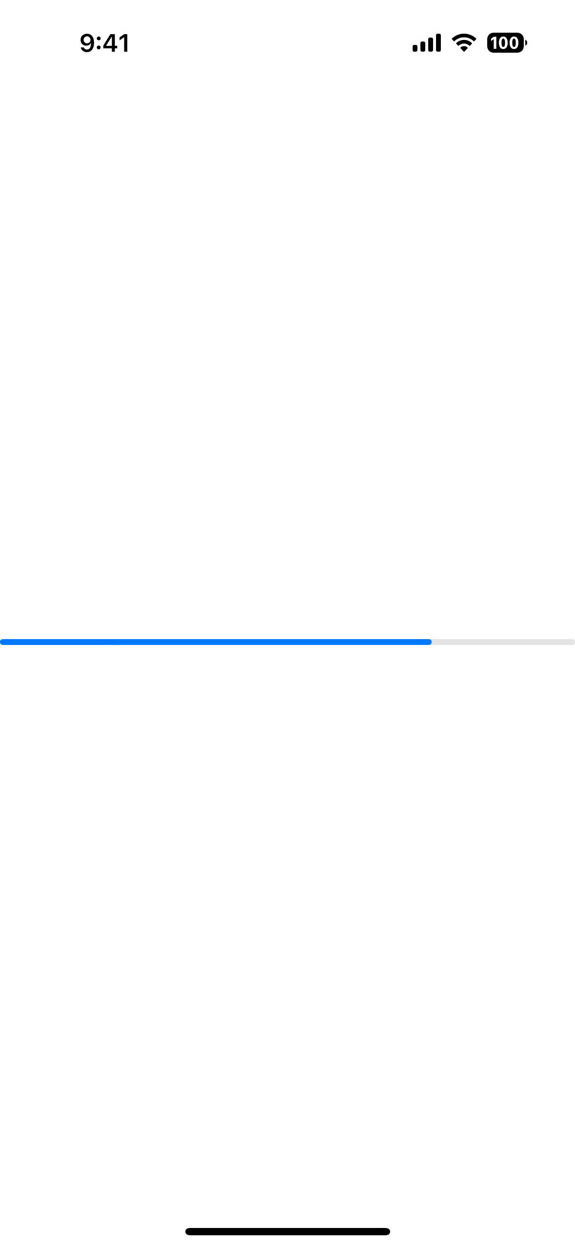

xml
<Progress value="75" />Example
Styling the Progress bar
To style the Progress bar, set the backgroundColor and color.
The backgroundColor will be applied to the track, and the color will be applied to the bar itself.
xml
<Progress
  value="75"
  backgroundColor="#fff"
  color="#000"
/>
Props
value
ts
value: numberGets or sets the current value of the progress bar.
Must be within the range of 0 to maxValue.
maxValue
ts
maxValue: numberGets or sets the maximum value of the progress bar.
Defaults to: 100.
...Inherited
For additional inherited properties, refer to the API Reference
Native component
- Previous
- Placeholder
- Next
- ScrollView

